Rising Smoke BAR-BQ, nestled inside Rising Storm Brewing Company, prides itself on its commitment to quality, authenticity, and approachability, creating a warm and welcoming atmosphere for customers to enjoy the time-honored tradition of BBQ as an accompaniment for the artfully crafted ales and lagers of their partner brewery.
The brand’s tone of voice is fun, witty, and approachable, appealing to people in their 30s-40s who frequently visit craft breweries.
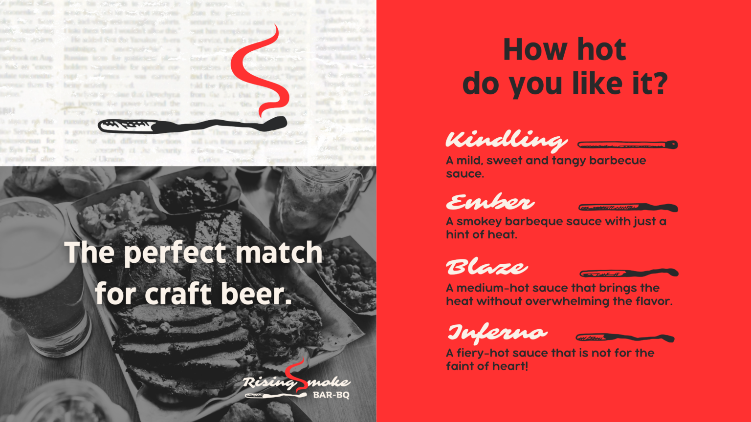
The brand’s visual identity is characterized by a bold, playful combination of fiery red, smoky black, and creamy white, with typography that is both strong and playful.
Logo
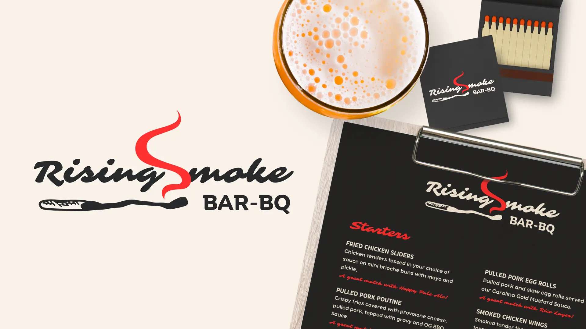
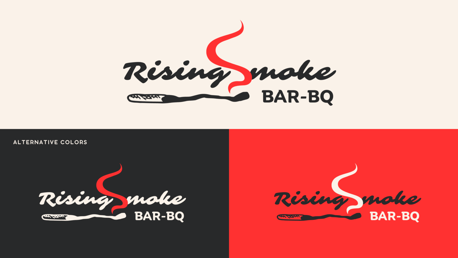
The logo features a burnt match with a wisp of smoke rising from the head – a playful nod to the smoky, fiery flavors of BBQ cooking. The burnt match is a visual pun that invites customers to find the “perfect match” for the craft beer they are drinking. It’s a visual shorthand that customers can instantly recognize and associate with the brand, making it an essential element of the brand’s marketing and visual identity.
It uses a clean vector-based approach to give the brand a simple, and professional look that adapts to various digital and print applications.
Typography
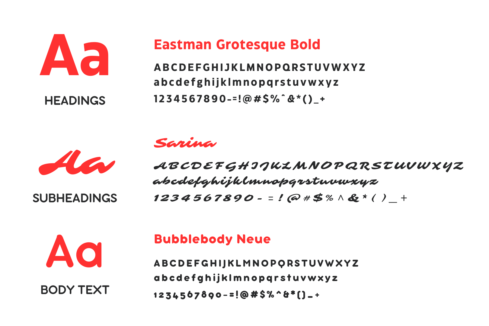
The use of multiple fonts adds visual interest and allows for a variety of visual expressions across different applications, from the website and menus to marketing materials and signage.
Eastman Grotesque Bold, with its bold, blocky lettering, is perfect for headlines and evokes a feeling of strength and boldness. The Sarina font, with its curvy, playful lettering, adds a touch of whimsy and personality to the subheadings. And the Bubblebody Neue font, with its rounded, friendly lettering, is approachable and easy to read, making it perfect for body text.
Together, these fonts create a unique and distinctive visual style that is both playful and bold. The combination of strong, bold typography with more playful and approachable fonts perfectly captures the essence of the Rising Smoke brand – a place where customers can enjoy the time-honored tradition of slow-smoked BBQ while still having fun and not taking life too seriously.
Color Palette
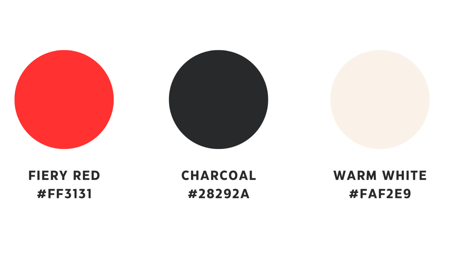
As the primary accent color, this fiery red is reminiscent of glowing embers, heat, and the flavor of slow-smoked meats. The smoky black adds a touch of sophistication and refinement, while the warm, creamy white complements the boldness of the red and black, adding a touch of balance and approachability to the brand.
Together, the brand colors evoke a feeling of warmth, passion, and authenticity – all key elements of the Rising Smoke brand. Additionally, the colors are versatile enough to be used in a variety of applications, from the website and social media to packaging and signage.
