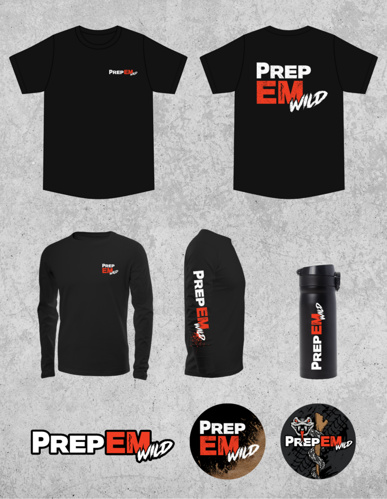
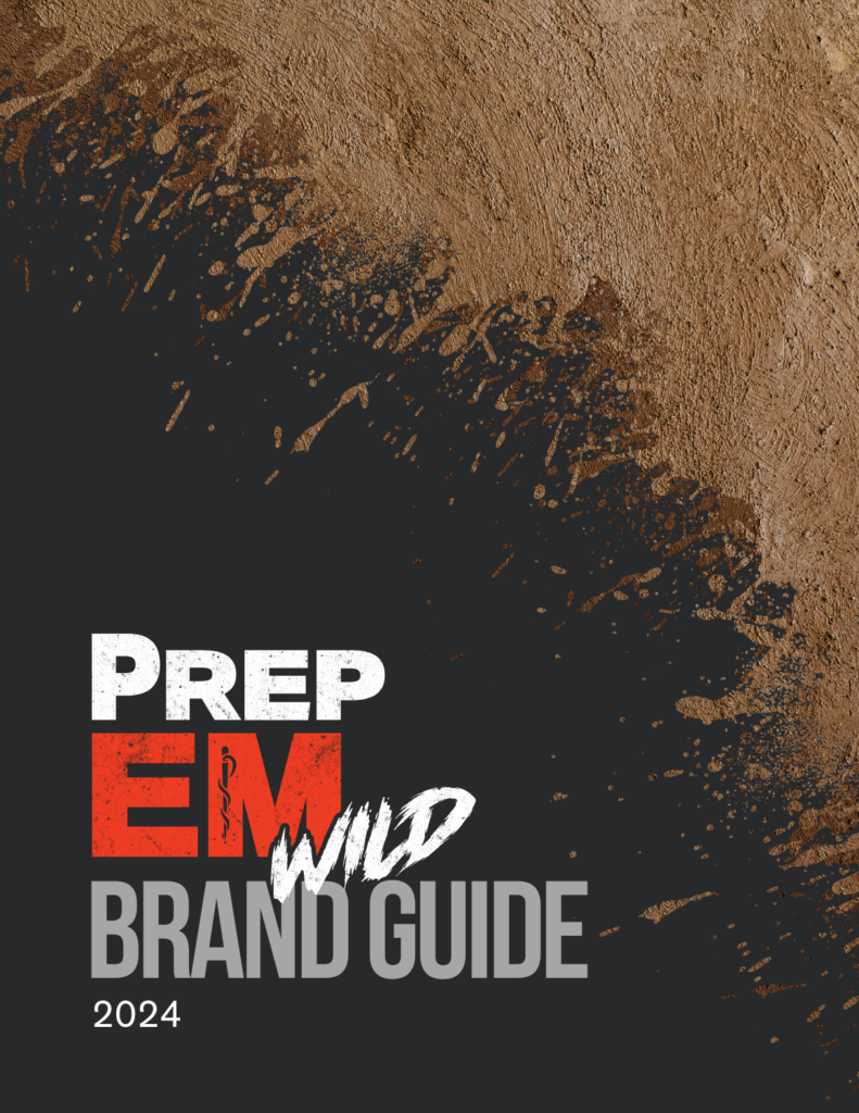
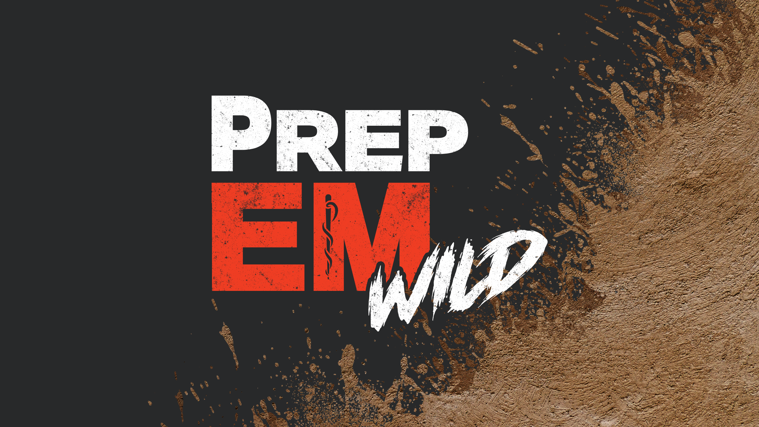
PrepEM Wild harnesses years of emergency medicine expertise to equip outdoor enthusiasts with the knowledge, tools, and confidence they need to explore and thrive in the wilderness. I had the opportunity to develop their visual identity and brand guidelines, defining their authoritative yet approachable tone and underscoring their unwavering commitment to preparedness.
Logo & Wordmark
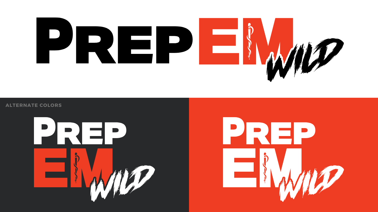
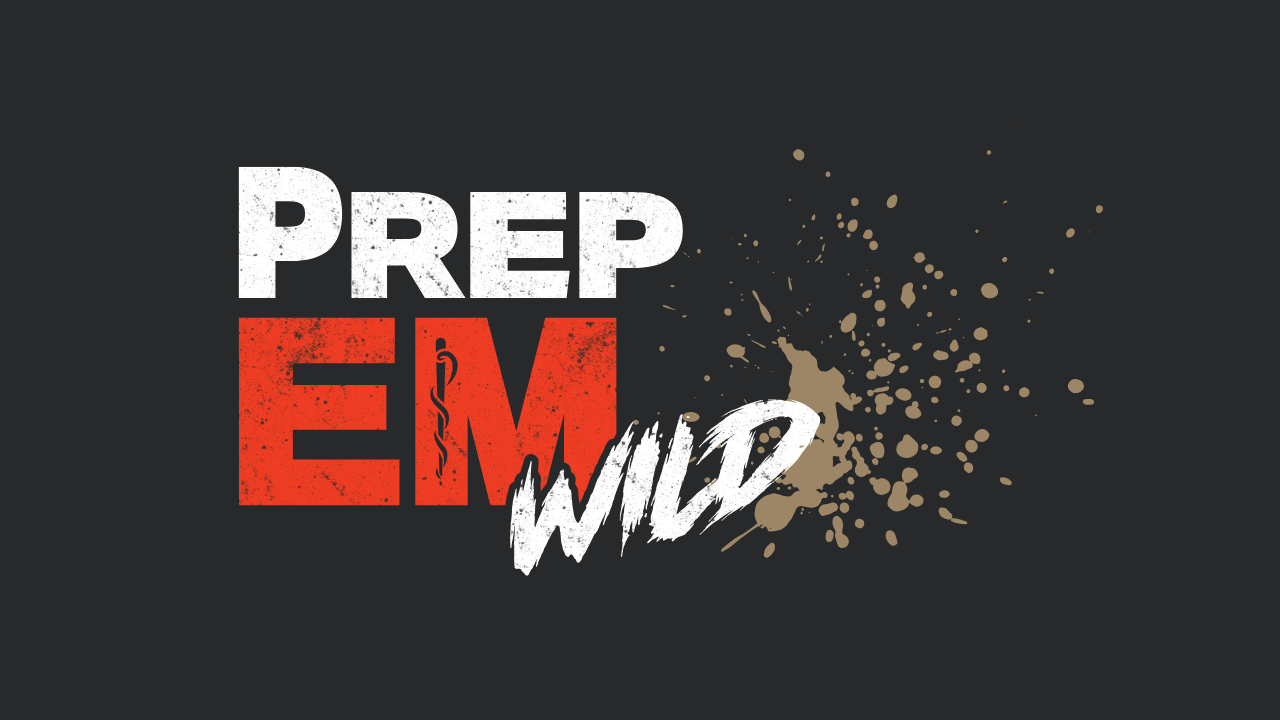
The PrepEM Wild logo is a bold text-based wordmark that speaks to both reliability and adventure:
- “PrepEM” appears in strong, sans-serif lettering, to convey strength and professionalism while ensuring the logo remains highly legible at any size.
- “EM” is highlighted in red, echoing emergency medicine and signaling urgent attention when it’s needed most. Within the “M,” the iconic snake-and-staff symbol references the brand’s medical expertise.
- “Wild” is rendered in the Horsemen font, injecting a sense of ruggedness and adrenaline that resonates with the thrill of outdoor exploration.
Visual Style
- Vector-Based Simplicity: To ensure versatility across digital and print media, I adopted clean vector artwork. This allows the logo and supporting graphics to remain crisp at any size—from website headers to embroidered patches.
- Grunge Textures: Subtle use of weathered textures and patterns introduces a rugged authenticity that appeals to outdoor enthusiasts, reinforcing the hands-on nature of survival and emergency preparedness.
Tone of Voice
PrepEM Wild communicates in a manner that is authoritative yet approachable. The goal is to establish trust through expertise and professionalism while remaining accessible to the audience. Whether speaking to seasoned outdoorsmen or first-time trekkers, the brand’s voice acknowledges the challenges of wilderness survival and encourages individuals to take proactive steps towards preparedness.
Deliverables & Implementation
- Logo Files: A versatile logo package including files suitable for web, print, and merchandise.
- Brand Guidelines: Detailed usage rules for logo, color palette, and typography.
- Tone & Messaging: Clear directives on brand voice, ensuring consistency and impact across all communications.
- Collateral Materials: Application examples, including social media graphics and merchandise mockups.
Through this brand identity, PrepEM Wild stands as a trusted partner and guide—one that not only prepares and protects but also inspires and uplifts, fueling a sense of community and confidence for every wilderness adventure.
